

UI/UX and frontend workflow
From Figma to CSS: A Shared Language for Designers and Developers
By Ghina Bou Ghannam · Published
A beautiful Figma file is only one part of building a website. The next challenge is making sure the developer understands the decisions behind it—not just how it looks.
Bridging the gap between design and development requires a shared system. When design decisions are clearly defined, a confusing handoff turns into a clear, straightforward implementation.
The problem: a finished design can still leave questions
A landing page can look polished while leaving important decisions unexplained. Which green is the brand color? Is that gap intentional? Do these buttons belong to the same component? What happens when someone hovers over a card?
A design can look great visually but still leave the developer guessing if the system behind it is missing. Unnamed layers, raw color values, inconsistent spacing, and missing states mean the visual idea is there, but the foundation for the code is not.
Our example: the Nuzha Adventures section
To illustrate this process, let's look at the Nuzha landing page, specifically the Adventures section: three adventure cards, a patterned background, a heading, and an “Explore All” call to action.
This provides a manageable example with enough variety to discuss layout, typography, colors, spacing, and reusable components—all within the same design.

The shared language between Figma and CSS
Before looking at the implementation, it helps to establish a simple dictionary. Designers and developers are often describing the exact same decisions, just using different tools.
| In Figma | In CSS |
|---|---|
| Auto Layout | Flexbox direction and gap |
| Named color styles | Color variables named by purpose |
| Text styles | Reusable typography values |
| Spacing scale | Shared spacing variables |
| Component sizes and states | Reusable styles and hover rules |
The point is not to translate every single layer into a line of code. It is to make the design intent clear enough that both sides can work from the same decisions.
Four decisions to make explicit
When moving from Figma to CSS, follow a clear pattern: identify the messy design, clarify the developer’s questions, improve the Figma file, and then write the corresponding CSS.
- Colors: Replace unexplained hex codes with names that describe their purpose, such as brand accent text and gold borders.
- Typography: Define text styles for the eyebrow and title, and discuss which text needs to scale across screen sizes.
- Spacing: Replace one-off gaps with a shared spacing scale, so the layout follows a consistent rhythm.
- Components: Treat small and large buttons as variants of one component, rather than unrelated drawings, and make interaction states explicit.
Spacing: use the same scale in Figma and CSS
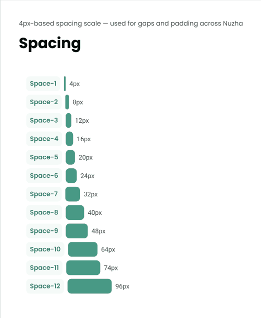
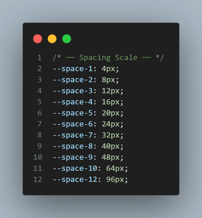
The Nuzha layout uses a 4px-based spacing scale, from compact 4px gaps to larger 96px section spacing. Naming those steps in Figma and defining matching CSS custom properties gives both sides the same reference instead of relying on one-off measurements.
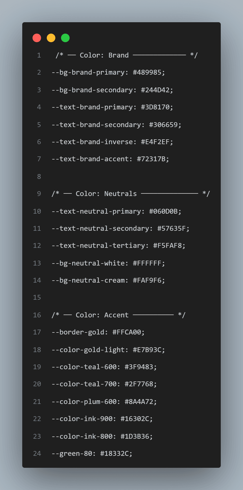
Colors: map Figma styles to CSS variables
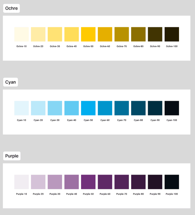
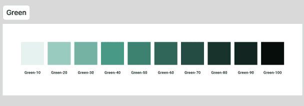
Color styles should carry the same names and intent across the design library and stylesheet. The Figma palettes group colors into usable steps, while the CSS variables provide those values to components without scattering raw hex codes throughout the page.
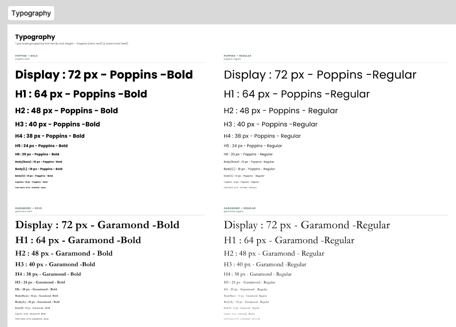
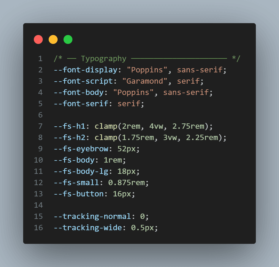
Typography: keep type styles in sync
The type scale defines font families, weights, and sizes for headings and body text. Keep those style names and values aligned with the CSS font and size tokens so responsive headings and smaller text remain consistent with the Figma specification.
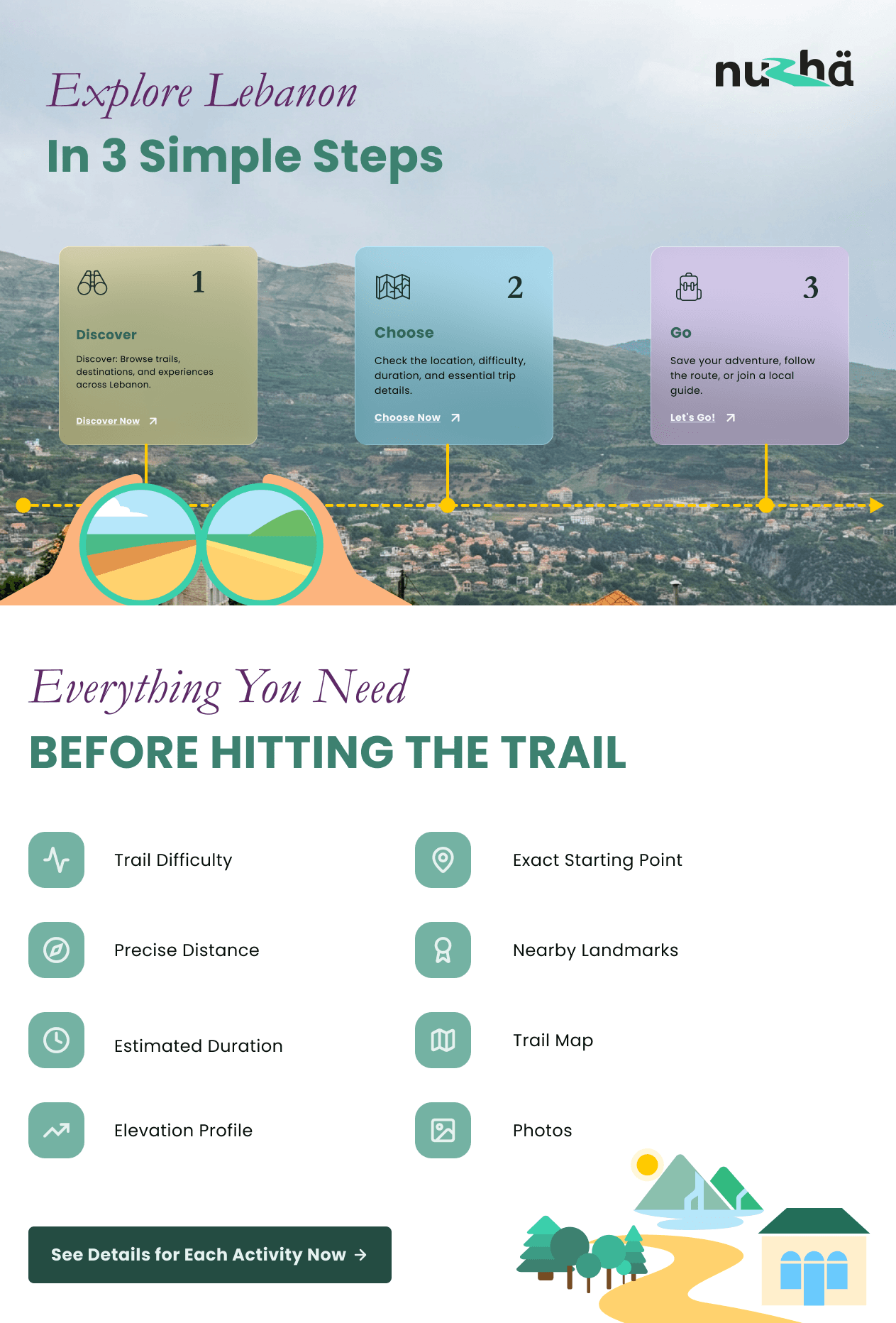
This system doesn’t just apply to one section. Applying the same logic to other parts of the page, like the "3 Simple Steps" section, ensures consistency from top to bottom.
From design decisions to reusable CSS
On the development side, those decisions become CSS variables and reusable component styles. A named color in Figma gets a corresponding token in the stylesheet. A spacing value comes from the shared scale. Button sizes use a common set of properties.
Connecting a card’s hover variant to its CSS hover rule means the developer doesn’t have to invent an interaction during implementation; they have an agreed behavior to build.
The takeaway: make the handoff a conversation
The goal is not to eliminate questions or automatically turn a Figma file into a finished website. It is about removing avoidable guessing.
When the design system and its intent are visible, and the implementation reflects those exact decisions, it becomes much easier to build a cohesive interface. A useful design system connects the people building the interface, not just the tools they use.
Practice both sides of the workflow
Explore our UI/UX Design Bootcamp for user research, wireframing, and Figma practice, or our MERN Stack Bootcamp to learn how to build and ship web applications.
Related reading
For a closer look at reusable design decisions, read Figma Design Tokens Explained.